Streaming Analysis
A set of data processing and visualization tools for transform and analyse non-uniform streaming reports from multiple distributors.
Stage 1: Transform, standartize and merge report data
Airtable Custom App
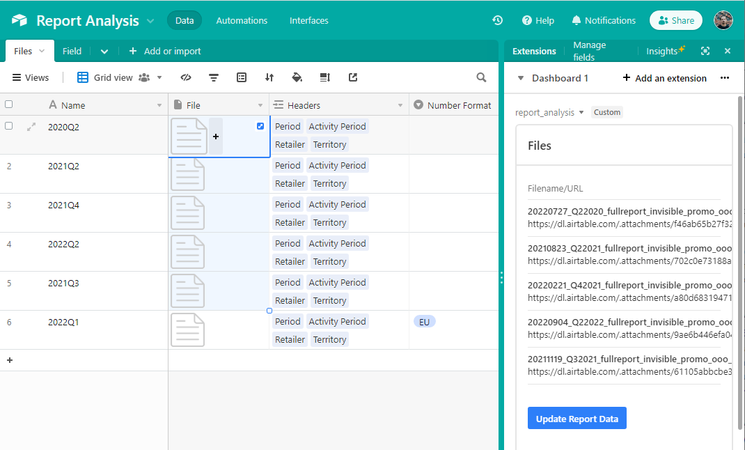
- transforms XLS, TSV and other formats to CSV, taking care of regional number formatting
- changes column headers to harmonize reports from different distributors
- upload the resulting CSV file to a cloud data-storage, using Dropbox in this case
Stage 2: Visualization & Analysis
Power BI document
A. Compare Top 10 DSPs (Digital Streaming Platforms)
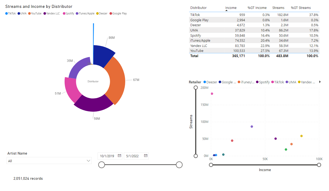
Aim
Compare Top 10 Digital Streming Platform by Income and Streams Amount to choose the platform with the best correlation of profitability and listener coverage.
For each Artist in the roster, select the optimal platform for targeting and promotion
Visualisation Tools
- Radial Histogram: Income dispayed as angle, Amount dispayed as bar height
- visualizes both Income and Streaming Amount distribution on the same chart
- Scatter Chart: Income on X-axis, Amount on Y-axis
- helps find the optimal platform by correlation of Income and Streaming Amount
B. Compare foreign countries
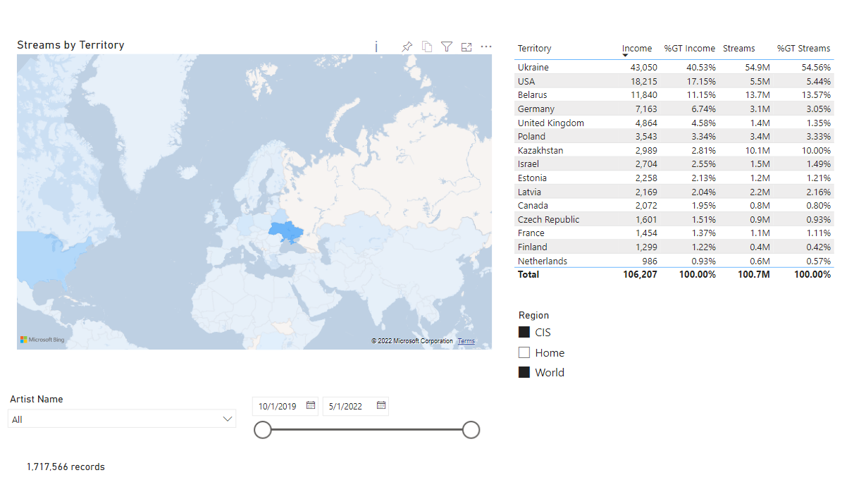
Aim
For each Artist select the top foreing countries for targeting, along the most efficient DSP for that territory.
Visualisation Tools
- Map Histogram: countries fill color indicates the Streaming Amount in the country
- Checkboxes to dividing the countries into 3 regions: Home (Russia), former CIS (a big % of Russian-speakers), the other World